top of page


What is HIVE.ai
Hive is a B2B desktop tool powered by a large language model, designed to assist researchers and learners worldwide in organizing and visualizing their thought processes. It bridges information gaps to spark inspiration and encourages users to independently explore ideas with subtle AI guidance.
Project Type
B2B
UXUI Design
Time Length
Market Impacts
Although the AI market is projected to reach $235 billion by 2025, the market lacks B2B products that train users' minds by encouraging expandable, adaptive, and original thinking. Hive aims to explore users' thinking paths to provide guidance and support for their rapidly growing knowledge.
Target Audience
Hive is primarily designed for researchers who require tools to deeply explore, organize, and present their thought processes while expanding their knowledge network with accurate information.
June 2024 - Dec 2024
Tools
Figma
Illustrator
My role in team of 5 designers
UXUI Design Lead
Marketing video editor
Product Demo
Creator: Huiyang Chen
Background
According to a study by Oxford University, 76% of researchers use AI tools in their work. However, only 16% of these AI tools are designed for research and data visualization, with even fewer created specifically for learning purposes.
Identified Product Gaps
01
Steep Learning Curve
Users face a steep learning curve due to the overly complex user interface, hindering efficient usage of the platform.
02
Lack of Growth Mindset
AI-generated structures and content offer limited flexibility for changes, failing to foster a growth mindset, identify missing information, or spark inspiration.
03
Limited Understanding of Complex Visualizations
85% of existing AI tools cannot create or interpret complex data visualizations, which are essential for research and data analysis.
Feature 1
Build From the Ground Up
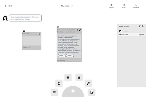
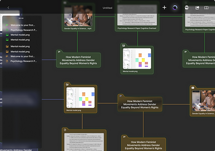
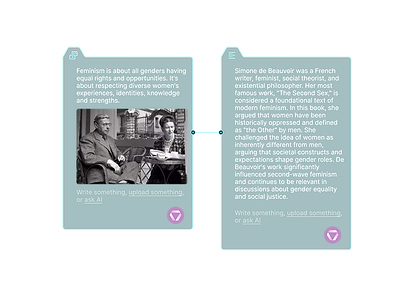
Begin creating node elements by dragging or uploading various types of materials, such as videos, images, voice recordings, links, and text, into an empty container on the freeform canvas.

Feature 2
Co-Create with AI
View node status, including information scarcity, disparity, and hierarchy, and discover new sources of inspiration by interacting with the AI side panel.
Feature 3
Smart Grouping
When topics are identified as interconnected, data points can be regrouped, and color coding will automatically adjust to represent their union.
Feature 4
Bridging Info Gap
Use the AI side panel to explore recommended data points that can fill in the missing links between nodes. The positions and colors of new clusters will be automatically generated.
Feature 5
Presentation and Self-Discovery
Transform each research project into infographics to showcase progress and findings while gaining insights into personal research and learning strengths across various topics.
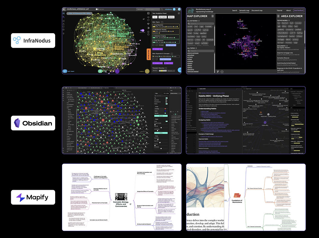
Research & Discover
Competitor Analysis
Identified Similar Gaps
Steep Learning Curve with Complex UI:
Users face a steep learning curve due to the overly complex user interface, hindering efficient usage of the platform.
Limited Flexibility and Growth:
AI-generated structures and content offer limited flexibility for changes, failing to foster a growth mindset, identify missing information, or spark inspiration.
Inaccurate Keyword Filtering:
Filtering information using keywords is often inaccurate, which prolongs the process of finding relevant materials.
Discovery
Our team conducted 35 semi-structured interviews with graduate researchers from top 50 universities in the U.S., with 23 participants providing detailed walkthroughs of their current tools and research methods.
"When I’m deep into research, I tend to focus on isolated pieces of information and miss the bigger picture of how everything ties together."


"I sometimes lose sight of how my initial thoughts transformed as I dug deeper into the research. It feels like the process gets blurred."
(Images from zoom interviews)
Through observations from field research, I discovered that their work space were set up in a modular way that a different areas of the desk dedicates to a certain function. The intention was to see hierarchy in tasks and to categorize information into big chunks. This helps them to improve memory retension.


Understanding User Needs
5 top representing user samples that were then chosen based on the user interview documentation.

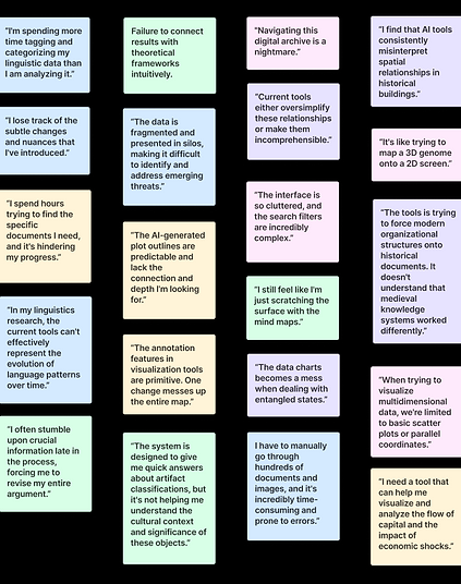
Main pain points
01
Over-reliance on AI
Over-reliance on pre-set prompts for quick answers diminishes curiosity and ability to self explore, further leads to untrained minds.
03
Challenges in Tracking Learning Progress
Failure of seeing how thoughts evolve impedes reflection and motivation.
02
Fail to identify interconnections
Difficulty adapting to knowledge web as a whole leads to lack of comprehensive understanding across topics.
04
Difficulties in presenting collective thoughts
Time-consuming to create a visual representation of the entire research scope from multiple data perspectives.
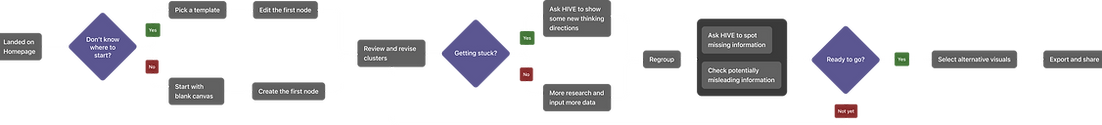
User Journey

These time-consuming steps can lead to fatigue due to:
Difficulties in remembering key insights from large datasets.
Uncertainty about where to restart when parts of the research need to be revisited.
Struggles in effectively presenting ideas.
Concept Development
Ecological Thinking
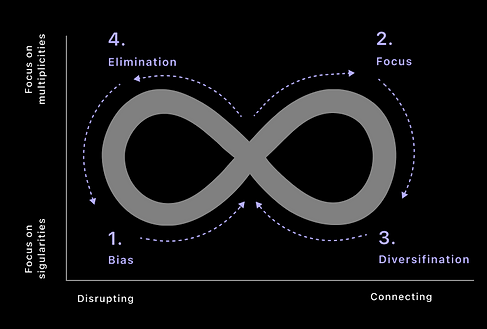
Ecological thinking means no single idea dominates for too long. When one idea takes up too much attention, we risk falling into cognitive biases, narrow thinking, or even harmful thought patterns. This can disrupt the balance of our thinking and limit our ability to explore new ideas.
The goal for Hive.ai is to ecological thinking is to minimize bias as much as possible while encouraging divergent thinking and maintaining focus to ensure a healthy, balanced flow of ideas.
Features Map
After gathering insights from our research, my team and I brainstormed features to address user needs. We then prioritized them from high to low, which helped us identify the initial MVP.

💡
Unique Value Proposition:
We aim to minimize time-consuming, conversation-based AI features to prevent reduced user self-thinking time. Instead, we want to focus on implementing AI in features that identify gaps, provide information scope, and suggest new pathways.
Design
1. Starting with a Node Element
Exploration
One of the biggest challenges is to ensure efficient material input to quickly build up knowledge assets.
Tag-based information search nodes are very time-consuming to navigate to the target nodes.
A clustered interface makes it very difficult to track information.
An additional step is required to choose the type of node before inserting material.
Solution
Our solution is to offer freeform information containers that accommodate all input types—videos, images, text, and voice—minimizing the time required to input data into the correct entry point.


Directly drag materials from your computer desktop or input them from any device.
Encourage user-generated inputs instead of over-reliance on AI to initiate ideas.
Supporting idea generation from any source boosts creativity and imagination.

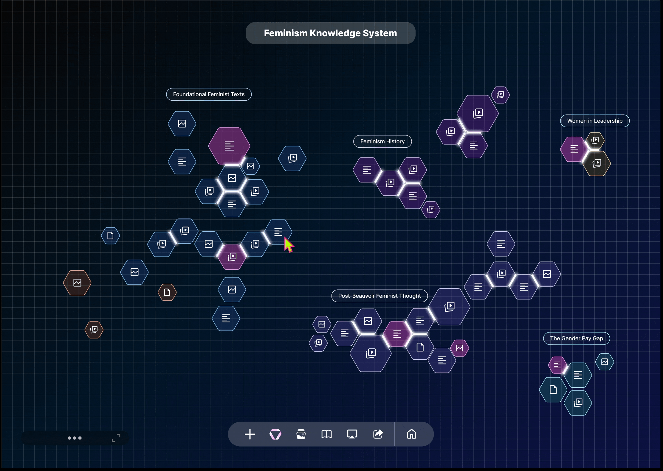
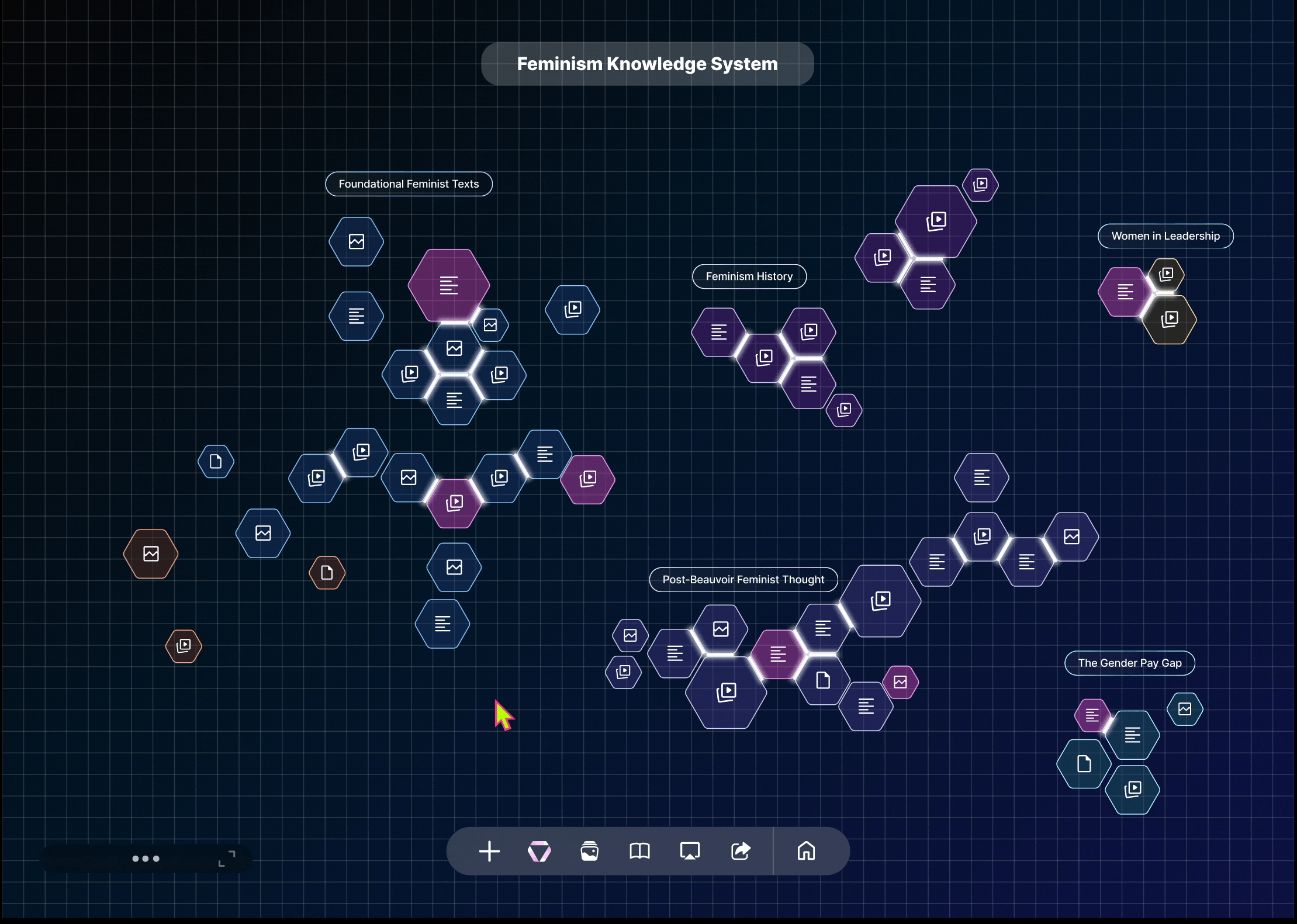
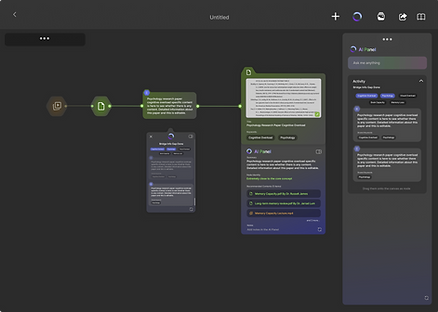
2. Connecting nodes
Exploration
Imagine having hundreds of data points with information scattered too widely to form meaningful connections.
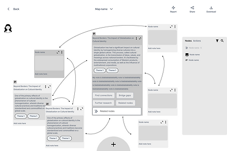
The industry-standard method of string-connecting nodes often turns data points into a visually overwhelming cluster, slowing down the process of targeting and grouping.
Difficult to identify the information hierarchy when data points become complex.
Solution
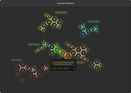
The solution effectively visualizes connections while highlighting information priorities, scarcity, density, and disparity. Furthermore, it incorporates AI-driven support to generate new nodes, fostering inspiration and innovation.


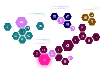
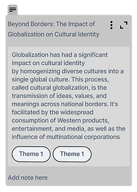
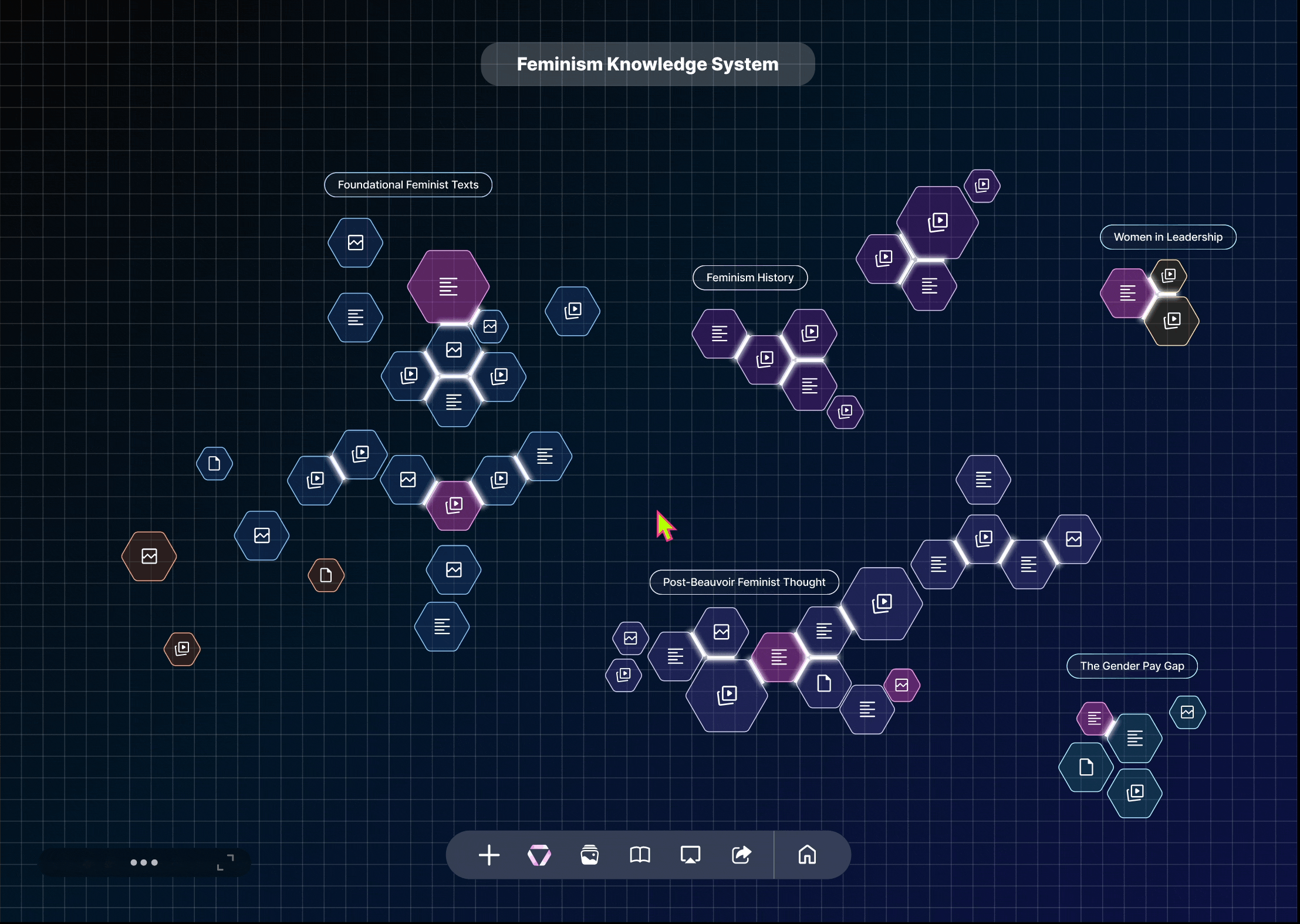
When zoomed out, the rectangular nodes with detailed information transform into hexagons, providing a quick overview of the scope and making it easier to find information.
The hexagon shape represent solid, expandable connections that can easily attach to similar topics, regroup, or detach.
The larger the hexagon, the more materials it contains.


Although the system supports user-generated content, the AI will assist in finding relevant information and automatically create a new node when inspiration is needed.
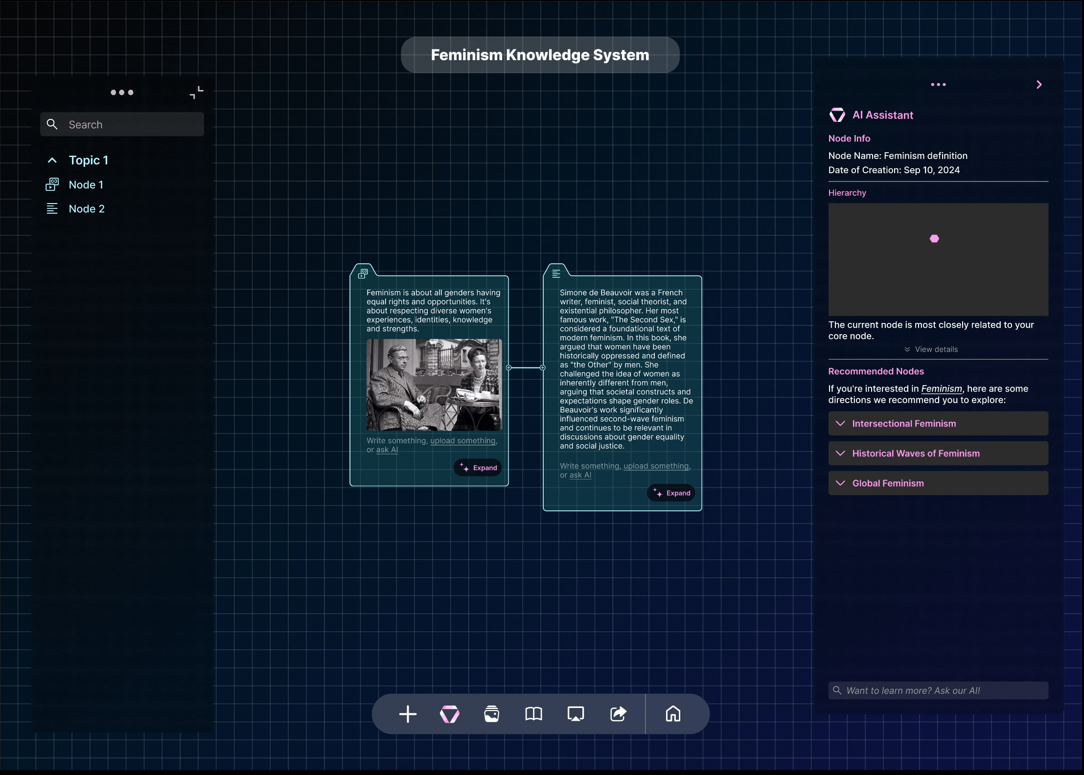
Information on similar topics is color-coded and grouped in various positions to represent cause-and-effect relationships within larger events.
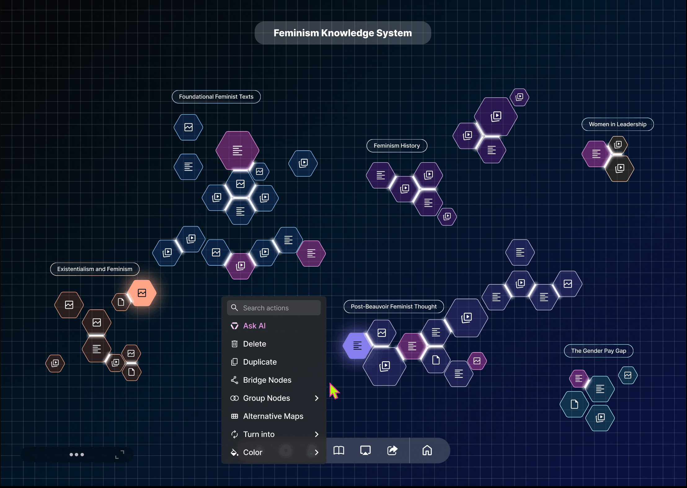
3. Bridging info gaps
Exploration
Tracking the progress of thinking has been one of the most valuable processes in research. Finding the missing data pieces will strengthen the knowledge web and improve memory retention.

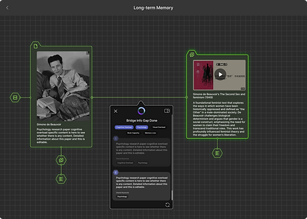
Using pop-up screens not only requires many clicks but also distracts from the visual when there are hundreds of nodes in the background.
Not giving users the option to choose the bridge outcome or providing too many filtering steps can result in either limited research or an unnecessarily complicated flow.
Solution
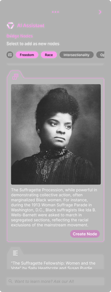
The solution is to present an animated bridging process that shows how ideas are merged and evolved.


Clearly present to users where the bridging will take place by encouraging them to review the content that needs to be operated on.
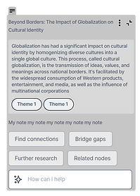
Provide alternative recommended bridging points in the side AI panel for users to browse and choose from.
Real-time updates to grouping when a new bridged point is added.
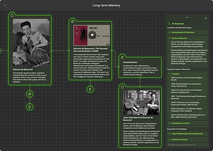
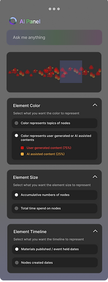
4. Understanding AI Panels
Exploration
Research indicates that many AI tools experience low user return rates due to prolonged learning curves, often caused by overly complex panels. Since panel content must adapt dynamically to different statuses, transforming complex information into clear and intuitive visuals becomes an even greater challenge.

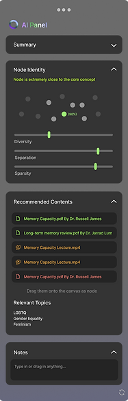
While the visual adjustment bar effectively conveys information hierarchy, displaying excessive information can lead to confusion.
The initial idea was to include all AI-supported functions in the panel for every user condition. However, this approach turned the panel into a text-heavy interface, requiring excessive scrolling and making it difficult to read.
Solution
The final approach focused on offering a deeper understanding of potential explorations within a single node and connections among information clusters, all while maintaining visual consistency.
(Panel when there is only one node)

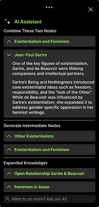
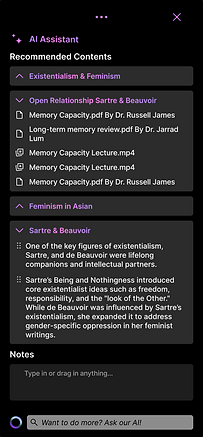
(Panel when there are multiple nodes)
(Panel when bridging nodes)
Conversational AI was included but not heavily emphasized at the start of the research, as the tool's primary goal is to spark original ideas. As a result, the chatbox is positioned discreetly at the bottom of the panel.
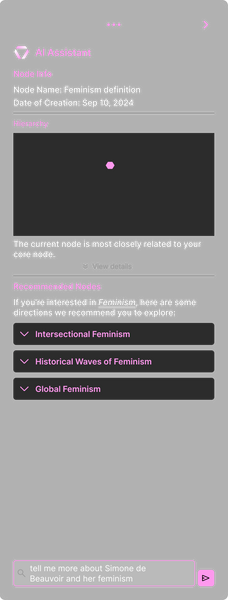
Information sparsity, density, and scarcity are calculated for each node to represent the information hierarchy. This helps inform the user of how closely the current node relates to the primary research topic.
Recommended information and detected missing information can be directly added to the canvas as new nodes.
When a node is clicked, the panel gently slides into the canvas from the right. The panel can also be accessed by clicking the HIVE logo in the bottom navigation bar.
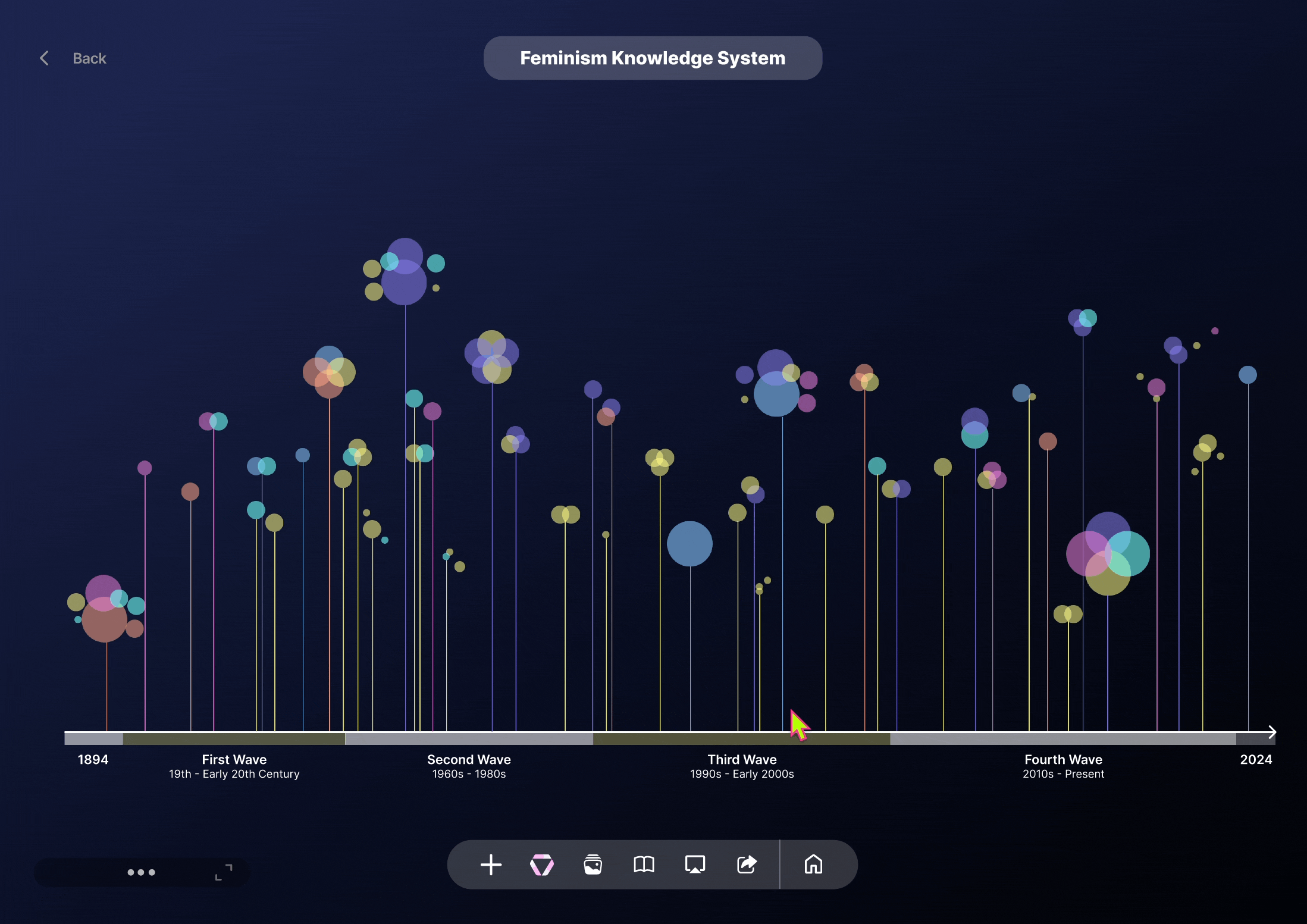
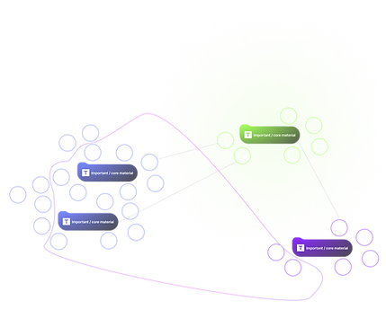
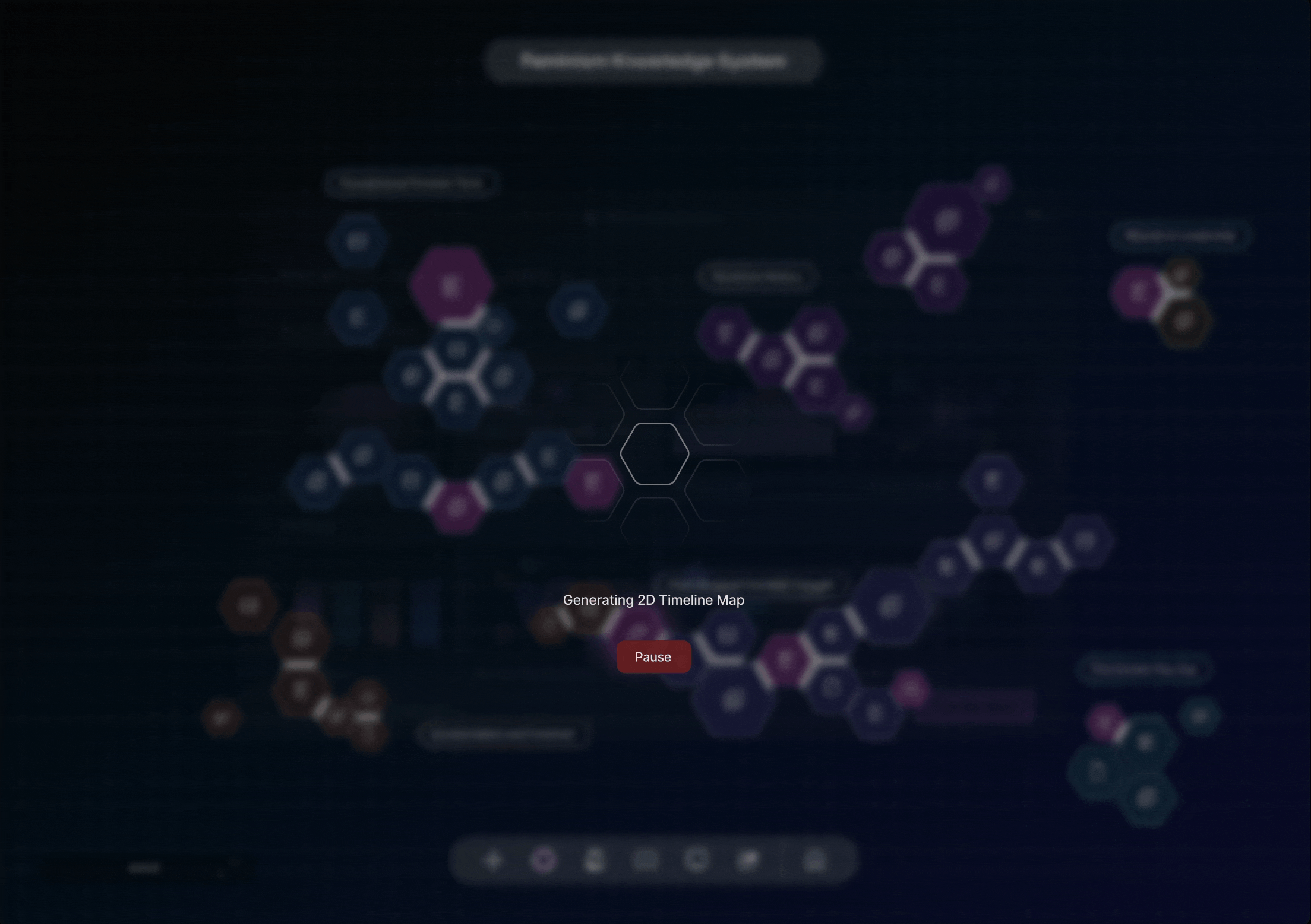
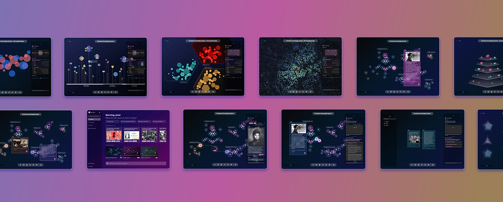
5. Presenting with Alternative Visuals
Exploration
Based on previous user interviews, many researchers expressed that presenting discovery outcomes has been a significant challenge, as extracting key data from long-term projects can be time-consuming. Therefore, the final challenge was to create alternative visuals that facilitate both presenting and self-learning, illustrating how ideas evolve across multiple dimensions and scales.
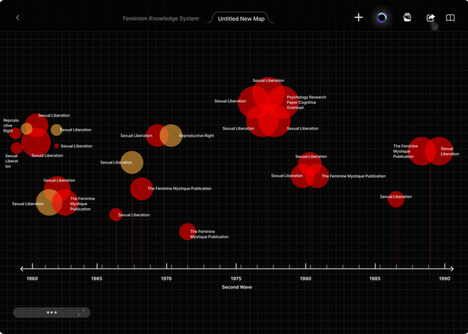
The timeline mapping successfully captures how ideas evolve while presenting the density and importance of each data point. However, the zoomed-in view can become overwhelming when information overlaps.
Extracting key information is already exhausting, and requiring multiple steps to adjust visuals can make it even more tiring. Offering users too many options for data adjustments can slow down the final refinement of key ideas.
Solution
The solution is to offer various data visualizations with built-in view modes, enabling users to switch between a presentation mode that highlights how ideas evolved and their information hierarchy, and a self-discovery mode that reveals how many ideas are AI-assisted versus original.
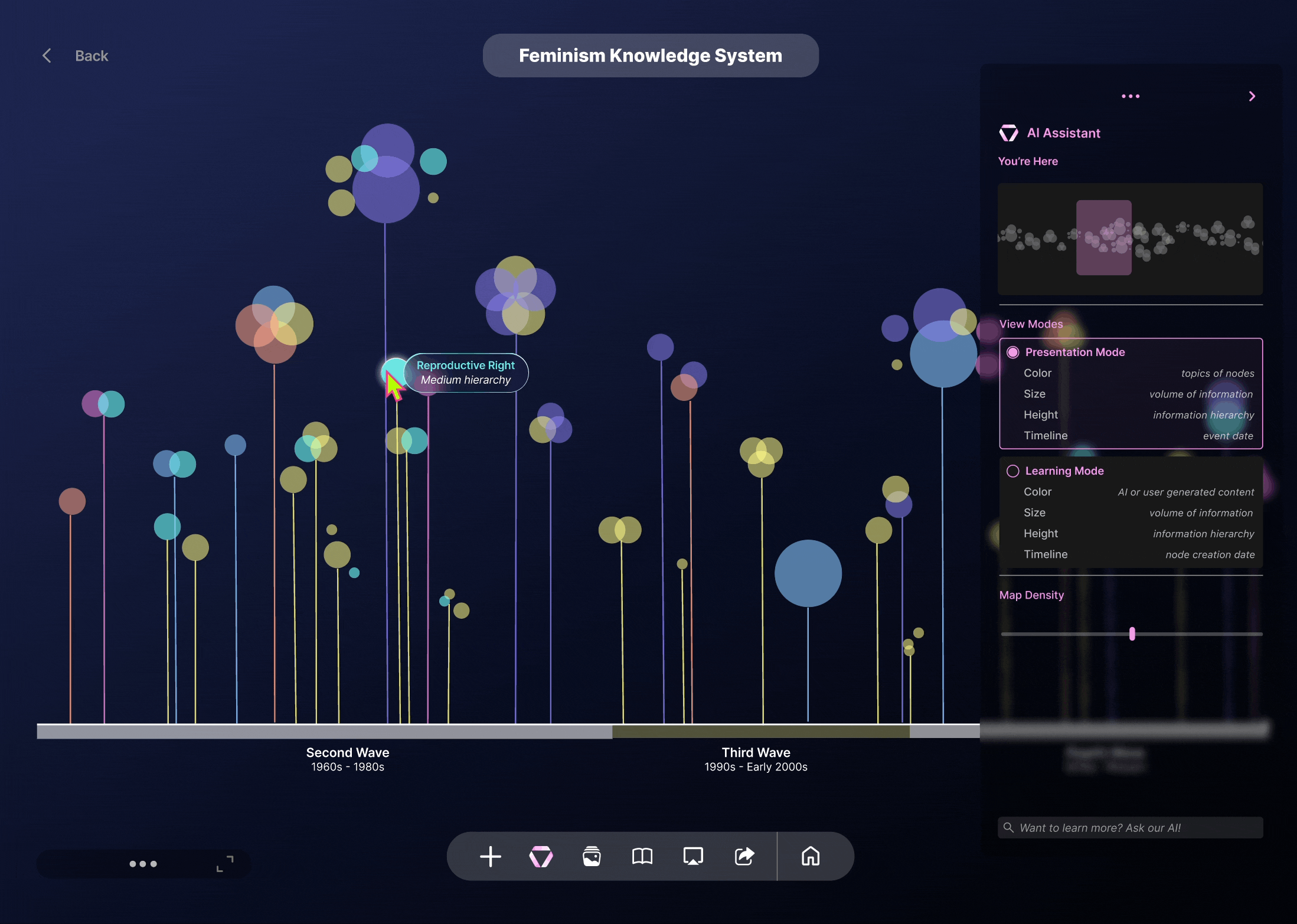
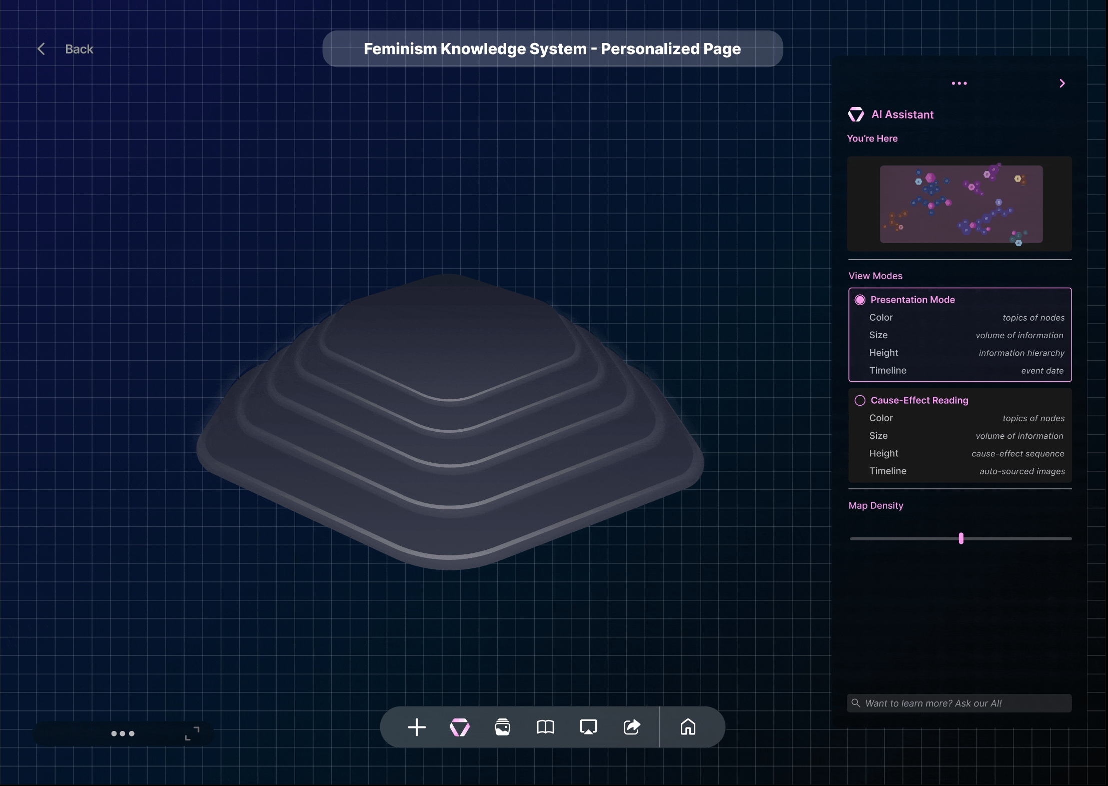
When view modes are switched, the dimension levels of height, size, and length are adjusted to represent different types of information.


Users can easily select the nodes they want to curate visuals for and generate diverse visualizations in seconds. The system will recommend the most suitable mapping for their data inputs, facilitating efficient presentation and discovery.
Impact and Outcome
User-Driven Design Process
One of the key takeaways was the importance of user feedback and iterative design. Conducting usability tests with target users has been crucial for B2B product designs, as each feature development requires a deep understanding of the specific challenges faced by stakeholders and identifying market gaps.
Navigating through uncertainty and making informed decisions, both individually and as a group, was a significant growth experience.
What's Next
Looking ahead, we envision expanding the reach of our solution through the development of extensions that can absorb information from existing research papers to generate data points.
We also look forward to diversifying our team by bringing in more engineers and psychologists to help develop a more comprehensive HIVE family. With a diverse team, we can benefit from a range of skill sets and backgrounds, providing us with unique insights.
bottom of page